Thursday, September 24, 2009

Classic Fountain Pens

Fountain pens are more or less the same shape and style.  The real challenge, then, is to make the pen's design interesting without compromising the basic principles of what makes a pen functional.  A pen would not work if it were an inch thick and a quarter inch long.  The user would be unable to support their writing motion with the rest of their hand and would tire quickly.  Nor would a pen work if it were thin as a nail and several feet long.  Once again, the user's fingers would quickly tire from having to work to hold such a thin, ungainly writing implement.
However, the color and texture of a fountain pen are limited only by the designer's imagination, and small variations in the traditional blocky cylindrical shape can be made, as well.


This is a typical fountain pen design.  It is a fairly standard design: it works because its design compliments its function, and it retains subdued values that invoke a sense of classiness and nobility.  People who bother with the hassle and mess of fountain pens typically enjoy either the old or the expensive, or both.  This pen fulfills both of these design "needs" well.


This is a slightly louder design.  The colors are all bright, simple shapes on a plain white background.  This pen is less classy, which makes it less attractive in my opinion.  The designer was obviously trying to make a piece that says "I'm classy enough to use fountain pens, but I'm not a wet blanket.  I like to have fun," but I think the overall effect comes across as merely gaudy.


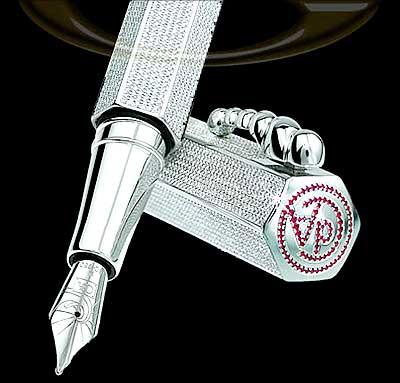
This pen is ridiculous.  It is encrusted with hundreds of tiny diamonds, and the manufacturer's logo is etched with tiny rubies.  This design reminds me of "bling" - It is wealth without class.  Strutting this pen around (or displaying it on your office desk) is merely making a statement: "I have more money than you."  If that is the intended statement, then this design works well. 
Otherwise, maybe place only one large diamond on the pocket clip instead of hundreds of smaller ones plastered all over the outside of the pen.  Make it more tasteful, and it would be a much better design.

Friday, September 18, 2009

Speakers Mk II

The preceding post discusses portable speaker systems, but does not address any non-portable, higher-power, stay-at-home systems.
These systems are designed to be left in place at home, plugged into either a desktop or laptop.  They usually have much more powerful amplifiers, and a larger variety of speaker types and sizes.  They, too, come in different shapes and designs; some boxy and ordinary, and some organic and unique.


This is an example of the former.  It is functional, but not particularly eye-catching.  The blue lighting helps to give it a more modern feel, but the overall design is the same as every other cheap 2+1 speaker set you can buy at any Wal-Mart.


This speaker is more like it.  From a functional standpoint, it is only mediocre: it has a relatively small set of speakers, and no sub-woofer.  From a design standpoint, it is whimsical and ironic, broadcasting the sound via an honest-to-goodness speech balloon.


These really take the cake.  It is doubtful that these would outperform the speech balloon speaker, but they are significantly more outlandish.  They are reminiscent of an oddly-shaped animal of some kind, and it is unclear whether or not the "tails" serve any purpose outside of pure aesthetics.  While the design itself is a novelty, the purpose of the design is unclear.  While the speech bubble speaker makes an ironic statement, these alien-looking speakers merely add an element of weirdness to the user's desk space.

Trendy Portable Speakers

In our changing world of portable devices and smaller, faster laptops, the average user only needs a mid-line laptop as their primary (read "only") computer. However, with this increase in portability comes a decrease in other "creature comforts," such as speaker quality. For most people, the small, underpowered speakers that are standard on all laptops work just fine. But for some (like myself) who dislike the horrible tinny sound of the tiny speakers, there are some options on the market.
There are two options: stay-at-home systems that are too bulky to carry around with you all time, and super-portable speaker systems. This article will cover the portable systems.
Most plug into the computer's headphone jack and contain their own battery. They usually have a storage method that makes them self-contained and easy to pack. Some are designed around interesting or fanciful shapes. Others are just designed to be an inexpensive alternative to poor sound.


These are my favorites.  They are designed by logitech, and snap together for easy storage.  My favorite part about these speakers is the subtle pun implied by their shape.  "Apple" is the name of the company that makes Macintosh computers, and putting these apple-shaped speakers with your apple laptop might get a few chuckles.

Thursday, September 10, 2009

Mae Night/Day


The band Mae (Multisensory Aesthetic Experience) has been releasing one song every month of the year 2009. Each song is released as a single, complete with its own album cover. This is is the cover for the song "Night/Day".

I really like this design. The photo transitions from starry night to cloudy daylight without a hitch. The difference in hues is soft, as the night is obviously waning and the daylight growing. One could almost believe that this is an unaltered photograph, if not for the nagging voice in the back of his head whispering this is impossible.

Mae happens to be one of my favorite bands, but sometimes they have odd tastes in cover art. However, this is one album cover that I love almost as much as the song itself. Multisensory Aesthetic Experience, indeed.

Monopol Records


Monopol is a crossover record company based in Germany. This design is their new company logo, designed by KITA | Visual Playground.

Honestly, I misunderstood this logo. The "P" in "monopol" looked more like a flash suppressor on a firearm than the 1/8" jack it is supposed to represent. The heads look like targets (They are supposed to be vinyl records). I assumed this was for a new first-person shooter or some sort of shooting video game. "Monopol" could be the name for a new totalitarian police force that is the basis for the game. The silhouettes are standing in assertive (almost aggressive) poses, which enhances the idea of violence and strife.

Until I read the blurb about the design and the elements involved, I had no idea this design was for anything other than a violent video game.

Saturday, September 5, 2009

Fantasy Knives


This pair of knives were props in the movie "Chronicles of Riddick," a sci-fi film with a small but avid following. Their design is vaguely organic; they have no straight edges to speak of, and are essentially long curves with edges.

From a functionality standpoint, they are severely lacking. The bulk of the blade hangs below the hand, which does nothing but shorten the effective reach of the weapon. The ridges in the top of the blade look dangerous, but would merely catch on things and hamper the quick movement necessary in knife fighting.

From a non-functional standpoint, though, these knives are pretty cool. They fit right in with the rest of the sci-fi action, which is all they were REALLY designed for, anyway.

Edit: Yes, the image is too big. Click on it.

Friday, September 4, 2009

Crazy Bridges

The dutch do things... oddly. Take this bridge, for instance.


While this bridge makes for a great bit of "local color," the strange diagonal design arose primarily for functionality's sake. The land around these canals is at a premium, and a diagonal single-cantilever bridge, like this one, is the best way to save space while still allowing both water and ground traffic.

I like it. Though functional, it also was "tweaked" to make it more aesthetically pleasing. The design of the counterweight is whimsical, complimenting the paint scheme (and the whole bridge layout) well. I also like how the roadway markings continue down the supporting arm (you can see it in the third picture).

Leave it to the people who gave us wooden clogs to conjure up something that is useful, but at the same time looks like it was taken from a fairy tale or Dr. Seuss book.